


Iris Naming and Brand Identity for Telecom Fintech
Naming, identity and launch system for the financial network built for telecom operators.
- Client
- Iris
- Industry
- Telecom fintech, financial infrastructure on Avalanche
- Services
- Naming, brand identity, messaging, website, launch campaign, merchandise
- When
- Launched September 2026
Key results
- Name, logomark and full visual identity for a new financial network
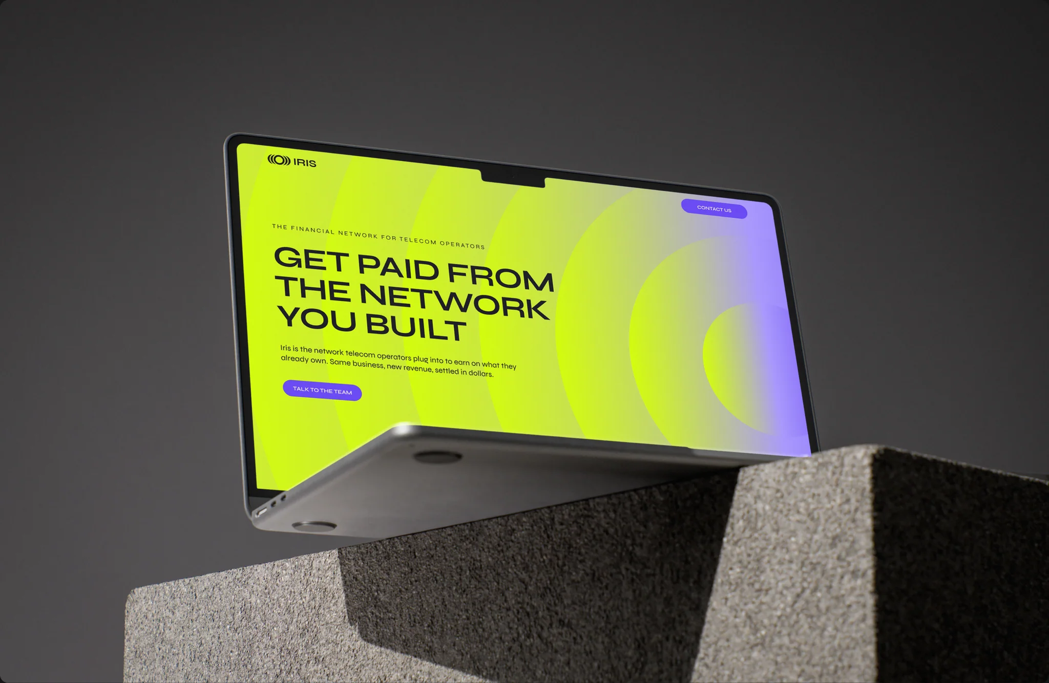
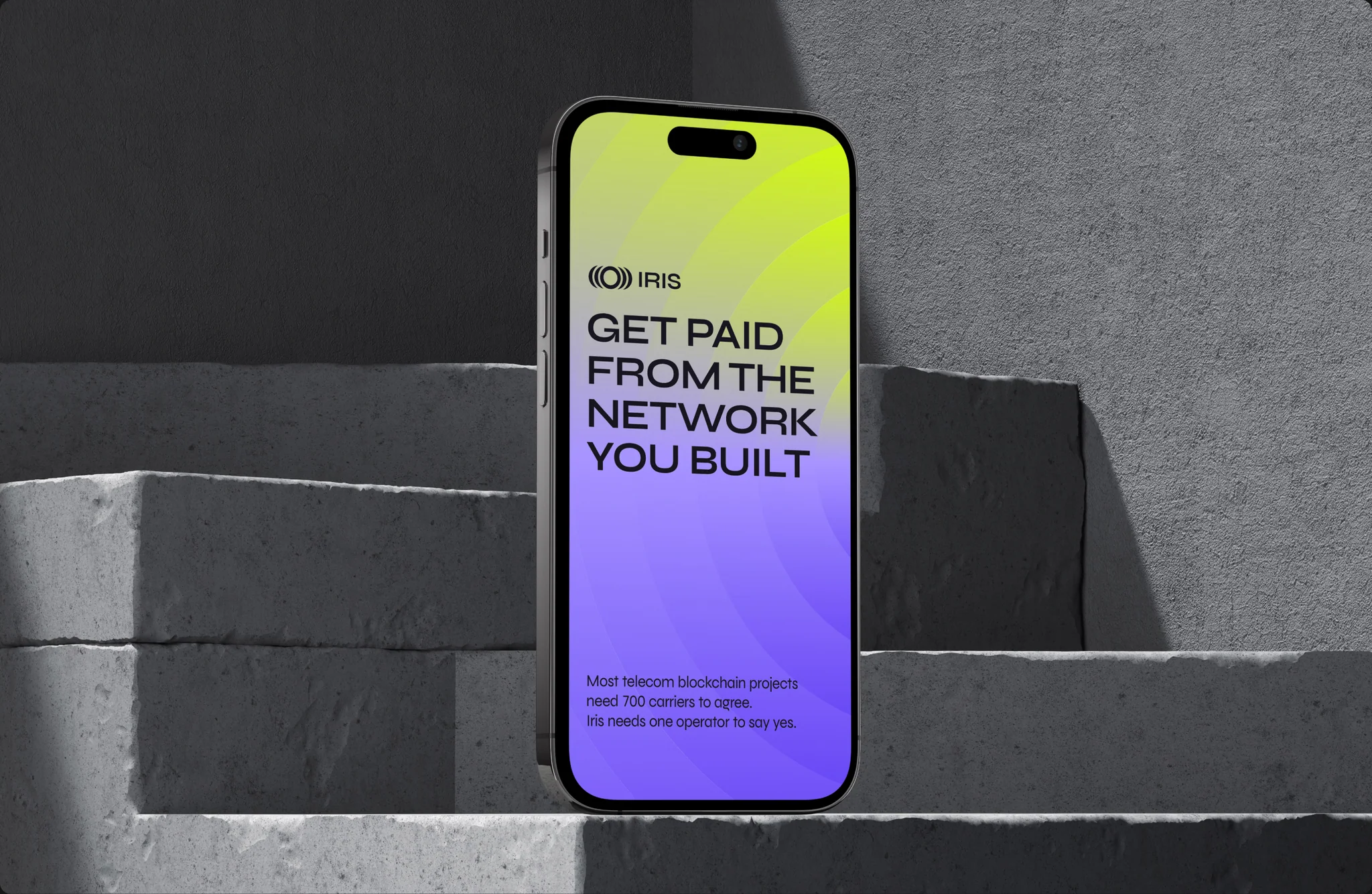
- Launch line built for telecom leadership: “Get paid from the network you built”
- Brand system rolled out across web, social, out of home, print and merchandise
- Iris exited stealth in September 2026 with a $43M commitment from Balesia Group and VIVA as its first live operator
The brief
Telecom operators built the infrastructure the digital economy runs on, then watched hyperscalers and app developers get paid for what was built on top of it. Iris is a financial network that lets operators plug their existing identity, billing and distribution systems into revenue-generating services such as advertising, settlement and financial services, without replacing their stack. It runs as its own network on Avalanche.
Iris needed a name and an identity, plus a launch story that telecom leadership would take seriously. The buyer sits in the CFO’s office, so the brand had to read as fintech infrastructure, with the blockchain kept firmly in the engine room.
Why the name Iris
X8C ran the naming sprint that landed on Iris. An iris decides how much light gets in and what comes into focus. For a network that helps operators see and capture the value already moving across their infrastructure, the metaphor works on first read and survives scrutiny. The brand values that came out of the sprint are Vantage, Precision and Sovereignty.
The mark and the system
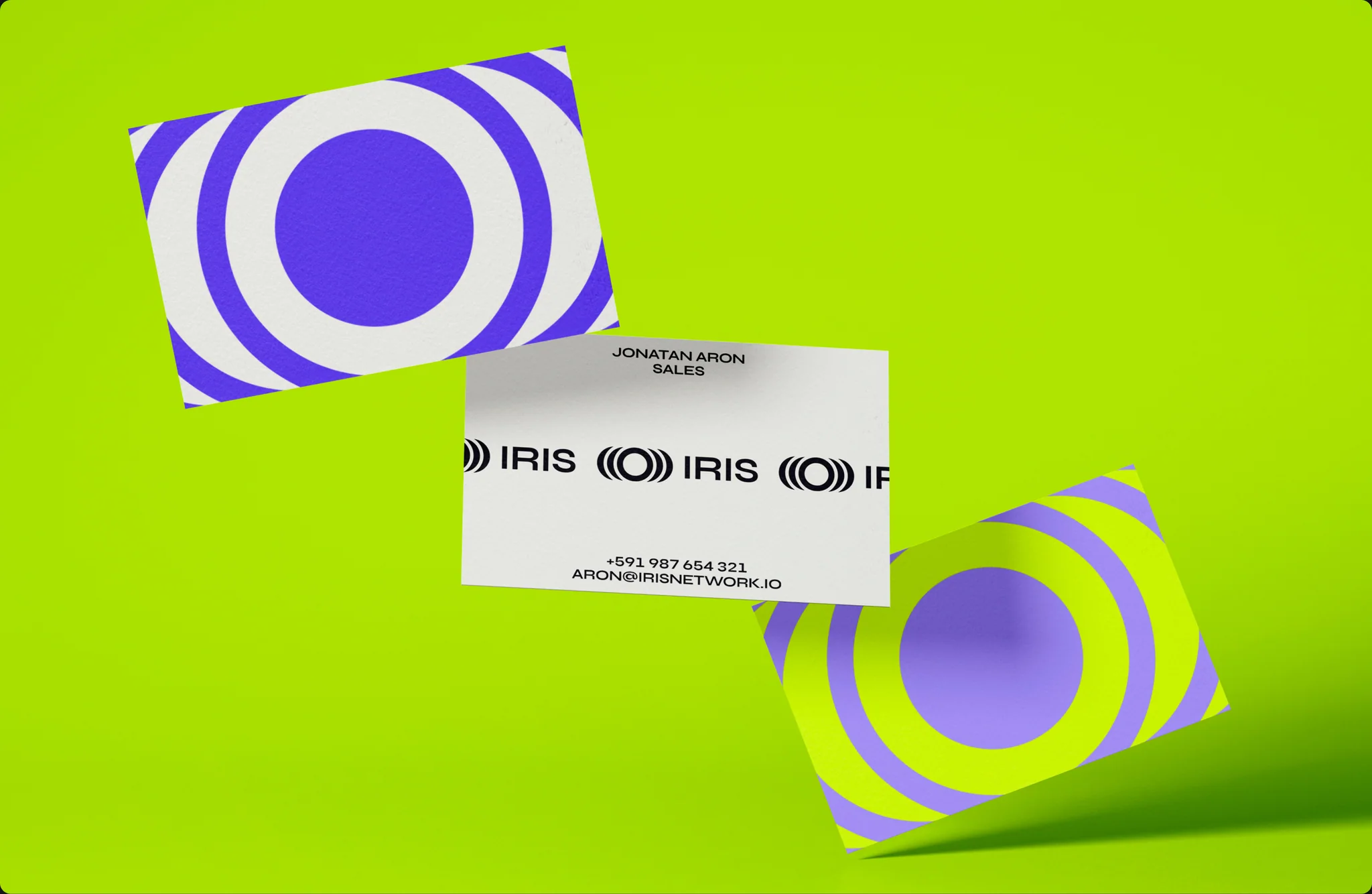
The logomark is a central ring flanked by nested crescent arcs. It reads as an eye and as signal waves leaving a source, and in motion it behaves like a camera lens finding focus. The same geometry scales from a favicon to a billboard.
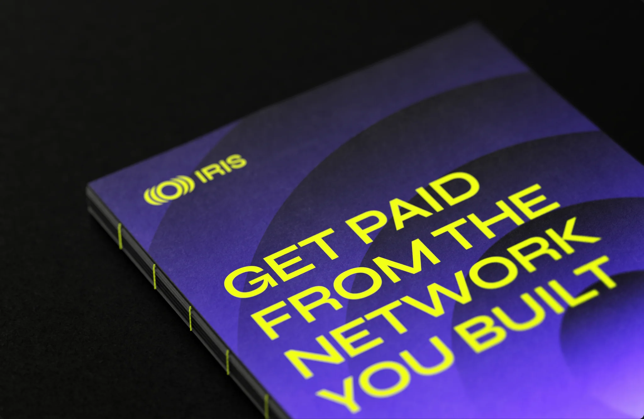
Violet carries the structure. Citrine is a highlight, used sparingly so it keeps its punch. Both sit on ink and paper, in a light register by default, with dark used selectively. The result reads as financial infrastructure first, which is exactly where a telecom buyer expects it to sit.
The message
The launch line is “Get paid from the network you built.” It speaks to the operator directly and names the value they are owed within the first five words.
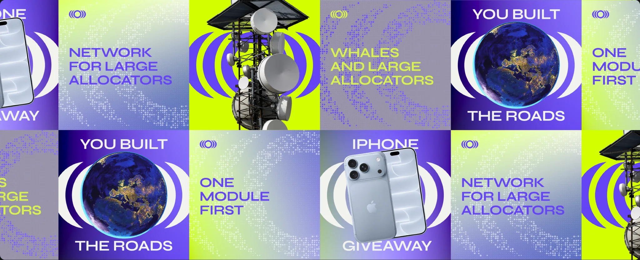
Out of home pushed the argument further with “You built the roads. They got rich building the city on top.” The line gives operators a story they already believe and positions Iris as the way to change the ending.
What X8C delivered
- Naming
- Naming sprint, shortlist and rationale that landed on Iris.
- Logo and motion
- Ring and crescent logomark with motion principles based on a lens finding focus.
- Visual identity
- Colour, typography, iconography and a brand book covering every application.
- Messaging
- Positioning and launch narrative written for telecom leadership.
- Website
- Design and copy for the launch site, desktop and mobile.
- Launch campaign
- Social system, out of home and merchandise for the public launch.


The launch
In September 2026 Iris exited stealth with a $43M commitment from Balesia Group and launched its financial network for telecom operators, with Bolivia’s VIVA as the first licensed operator live on the network.
FAQ
What is Iris?
Iris is the financial network for telecom operators. Operators connect their identity, billing and distribution systems to modules such as advertising, settlement reconciliation and financial services, without replacing their existing technology. Iris runs as its own network on Avalanche.
Who created the Iris brand?
X8C created the Iris brand: the name, logomark, visual identity, messaging, launch website and launch campaign.
What does the Iris logo represent?
The ring and nested crescent arcs read as an eye and as signal waves. In motion the mark behaves like a camera lens finding focus, which ties the logo back to the name.
What is the Iris launch line?
“Get paid from the network you built.” It speaks directly to telecom operators about the value created on top of the infrastructure they already run.
Similar works

Let’s get to work!